Vishal Singh · NYU Stern

Explore Interactive apps, data-stories, and case studies.

Teaching studios, apps, and data stories spanning public health, politics, business, and other public data. Filter by type or topic below — each piece opens in a new tab.

Browse by topic · 171 pieces

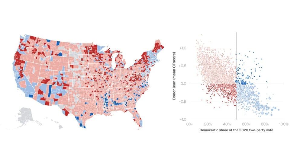
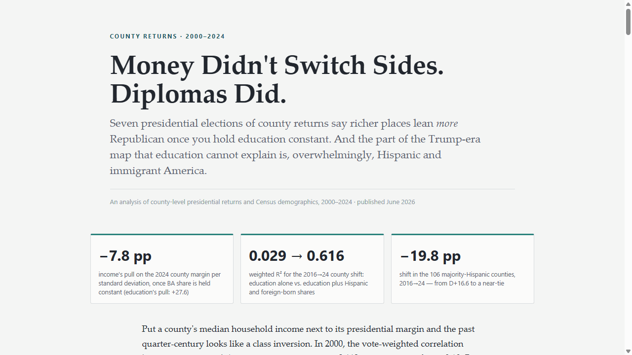
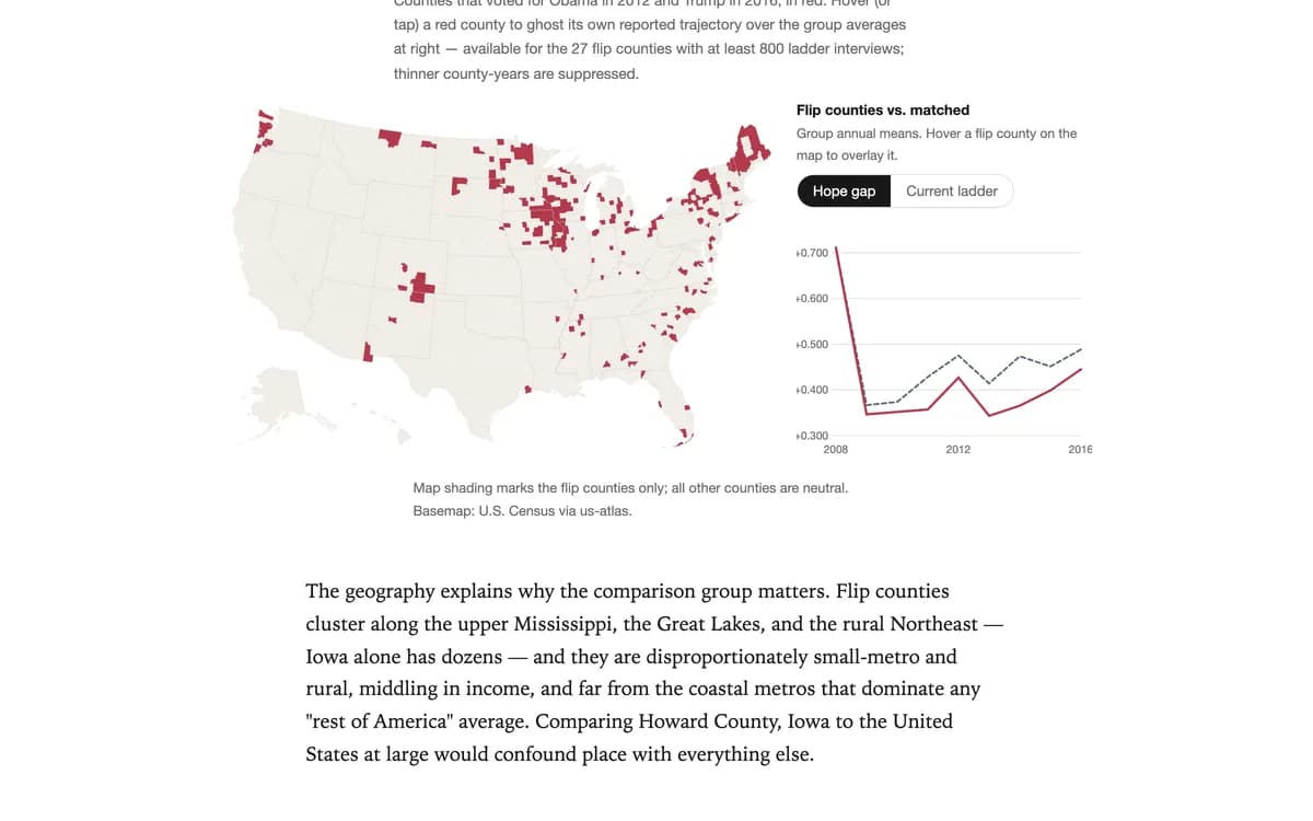
Presidential returns, county swings, turnout, and the electoral map — interactive atlases and data stories on how America votes.

App
Elections & Voting

The American Political Almanac · 1976–2024

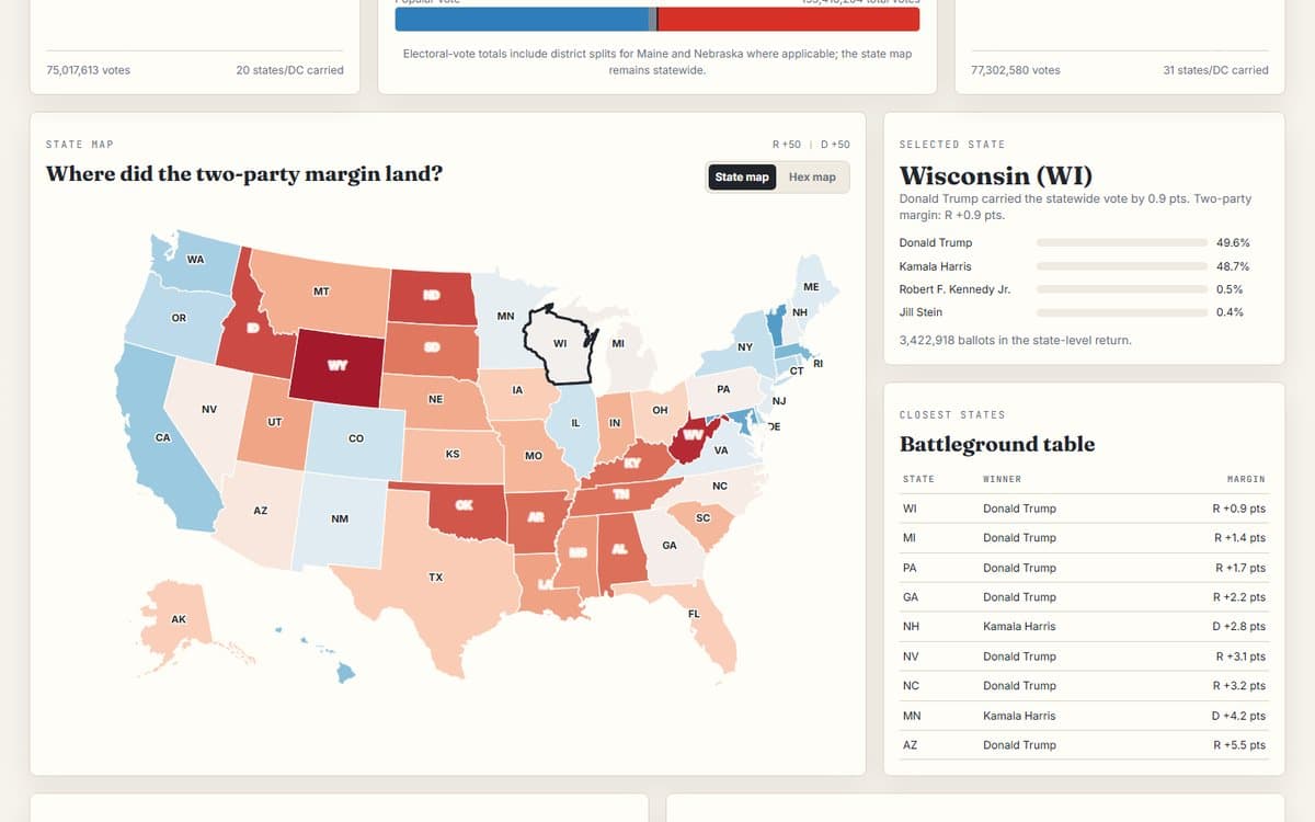
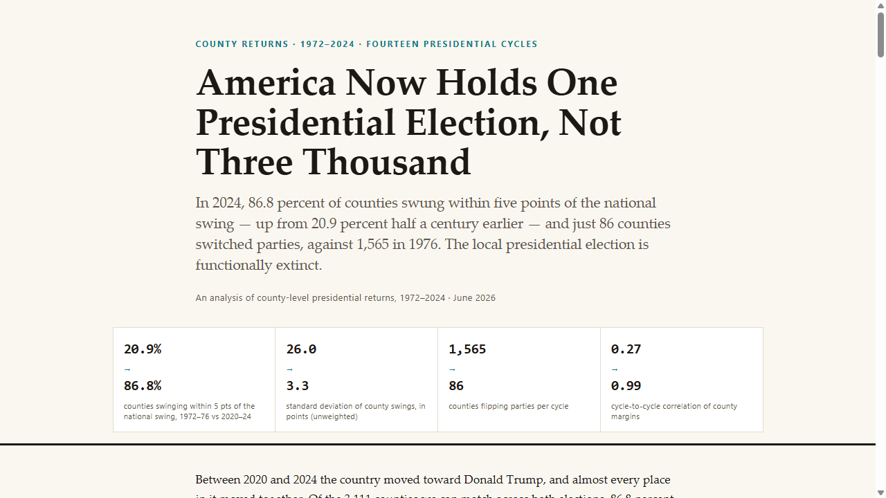
An interactive atlas of U.S. presidential elections, 1976–2024 — national, state, and county returns, demographics, and ANES survey shifts.

politicselectionsinteractive
Blog
Elections & Voting

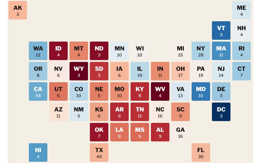
Presidential Election Atlas: 1976-2024

A state-by-state presidential election dashboard: move across 1976-2024, compare national outcomes, read the hex map, and inspect which states shifted most from the prior election.

ChoroplethElection returnsDashboard
BlogNew
Elections & Voting

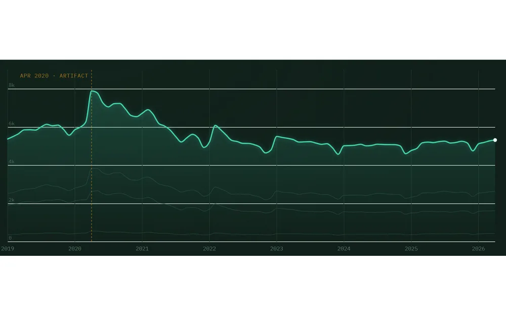
The Attention Budget That Wasn't

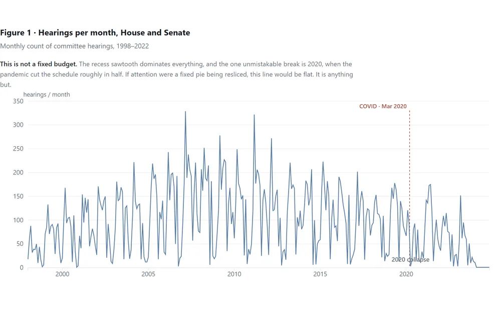
We expected Congress to have a fixed attention budget that crises reallocate. Across 25 years of hearings, it doesn't — the calendar rules, most shocks never register, and only a pandemic emptied the schedule.

Shock analysisTrend analysisTime series
BlogNew
Elections & Voting

The Floor Time Gap

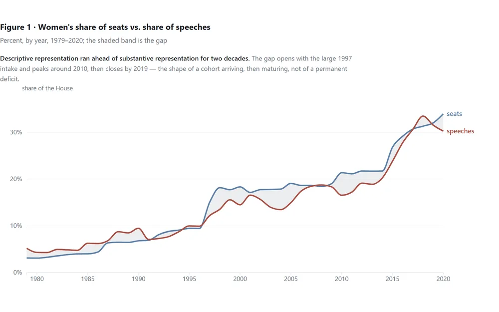
2.7 million Commons speeches: women won seats faster than they won the floor. But the gap was never that women speak less — it was who gets to be the busiest voice in the room.

Trend analysisDecompositionRanking
BlogNew
Elections & Voting

The Mainstreaming Clock

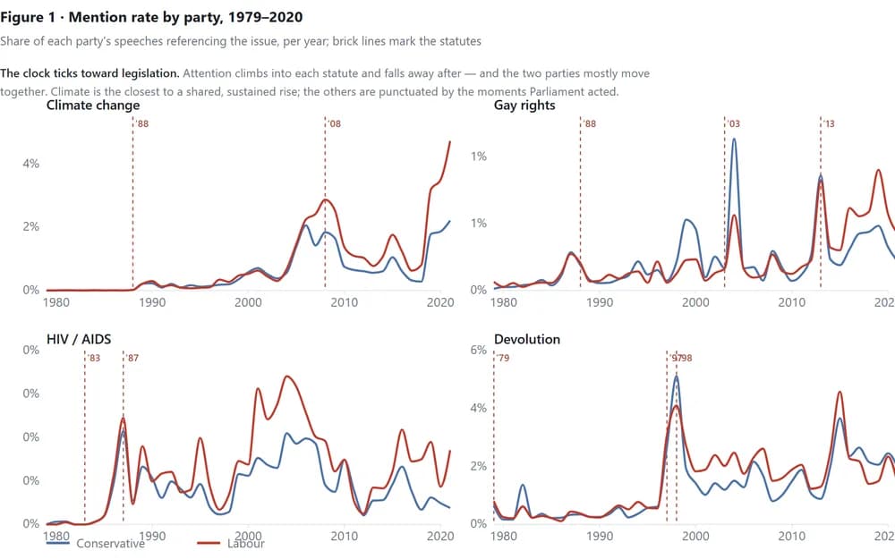
2.7 million Commons speeches, 1979–2020: issues enter the parliamentary record on the schedule of legislation, not ideology — and the party talking most is usually the one holding the pen.

Text analysisTrend analysisTime series
BlogNew
Elections & Voting

Who Gets to Testify

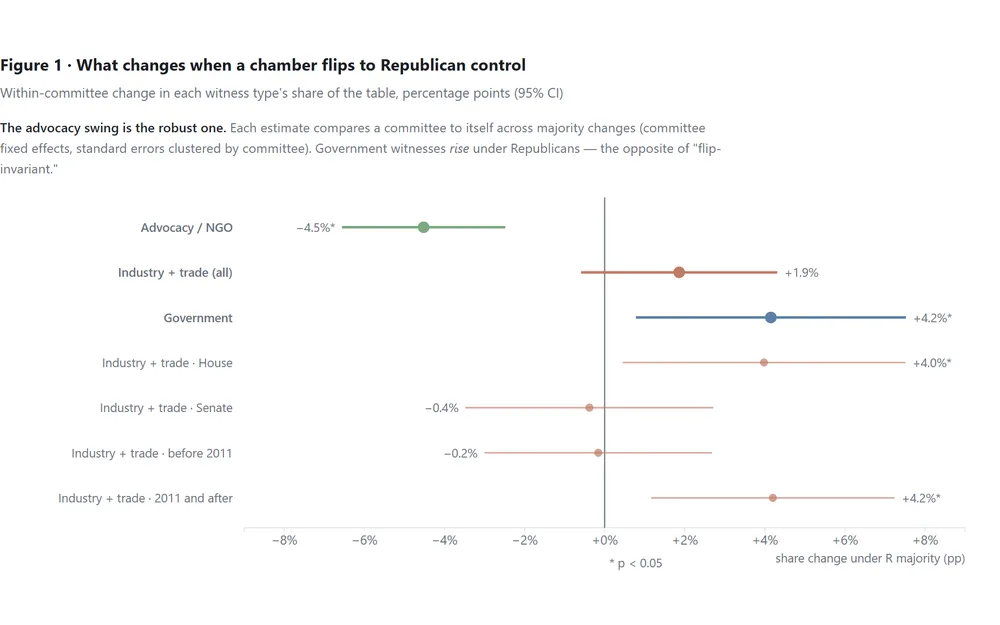
32,676 congressional hearings, 107,000 witnesses: when a chamber changes party, the witness table changes too — advocacy groups out under Republicans, and a professional witness class that testifies everywhere.

Causal inferenceSegmentationAdministrative data
See all 17 in Elections & Voting

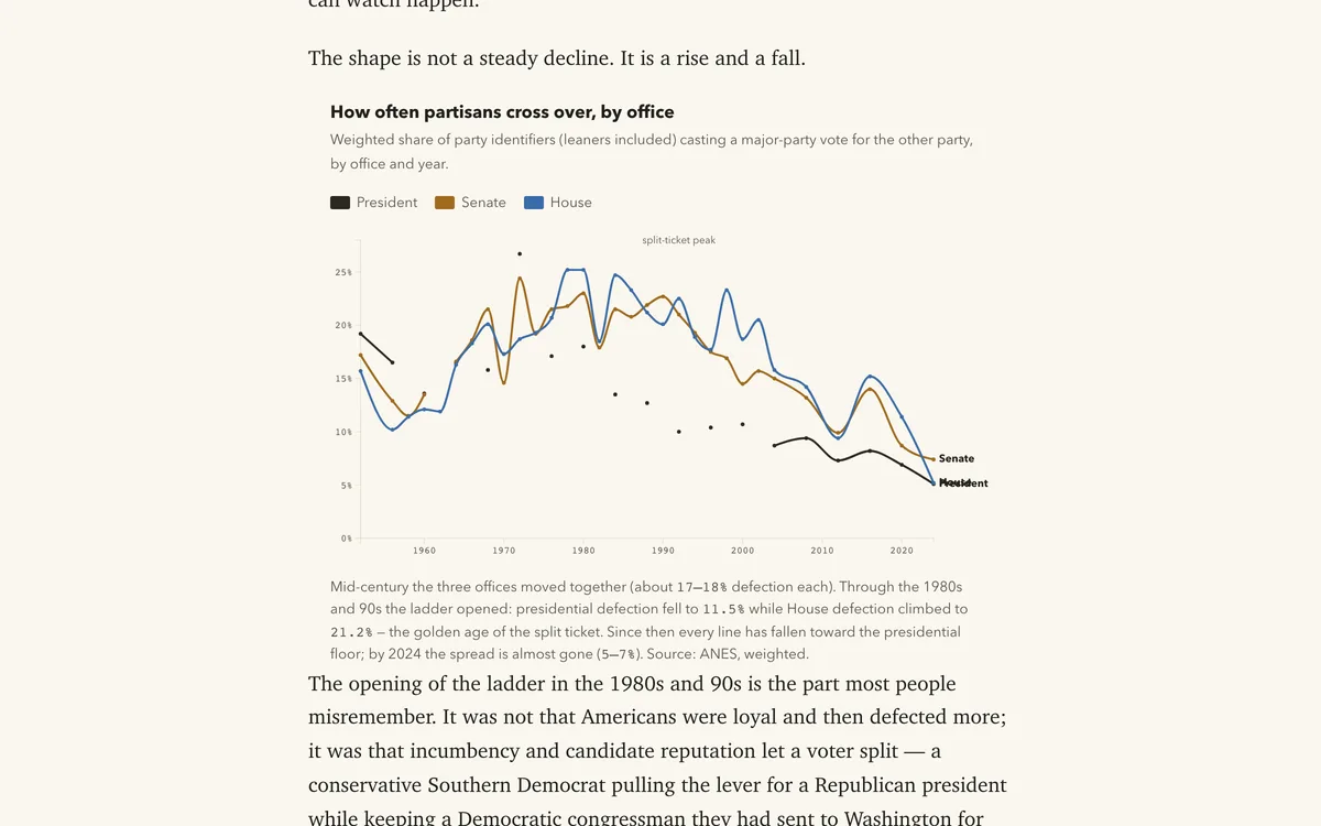
Party sorting, attitude gaps, and long-run survey trends — how American opinion divides, shifts, and hardens across groups and decades.

Blog
Polarization & Public Opinion

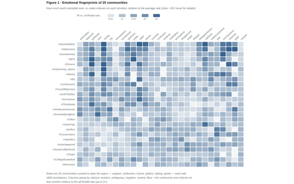
Communities Have Emotional Fingerprints

211,225 human judgments of Reddit comments reveal that communities run on distinct emotions — and that humans can't agree on what grief looks like.

Text analysisSegmentationNetwork
Blog
Polarization & Public Opinion

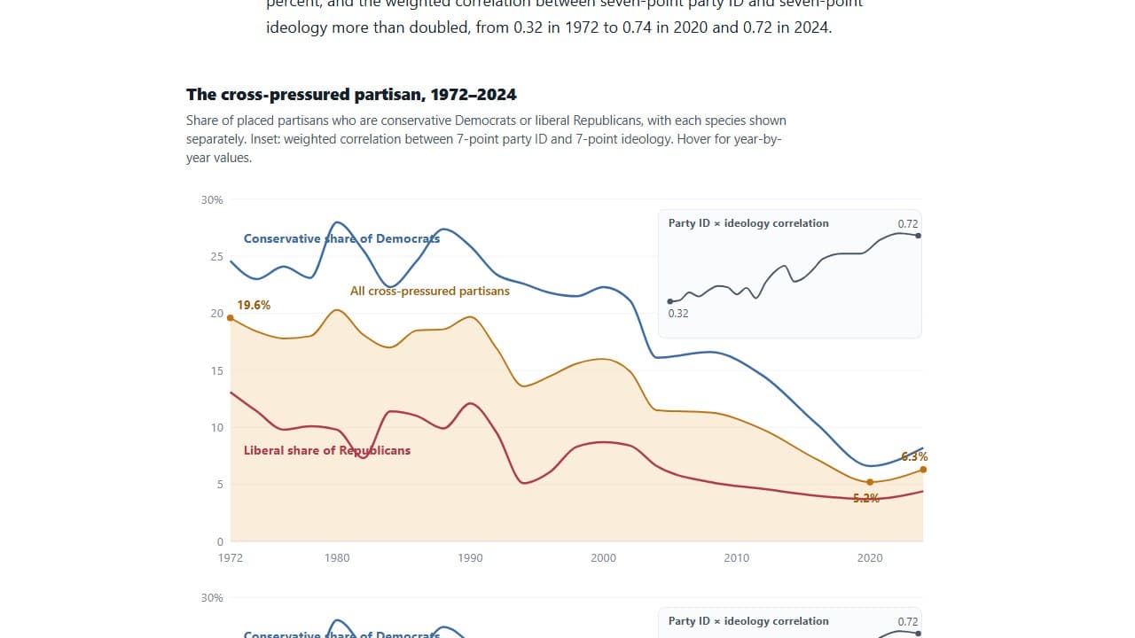
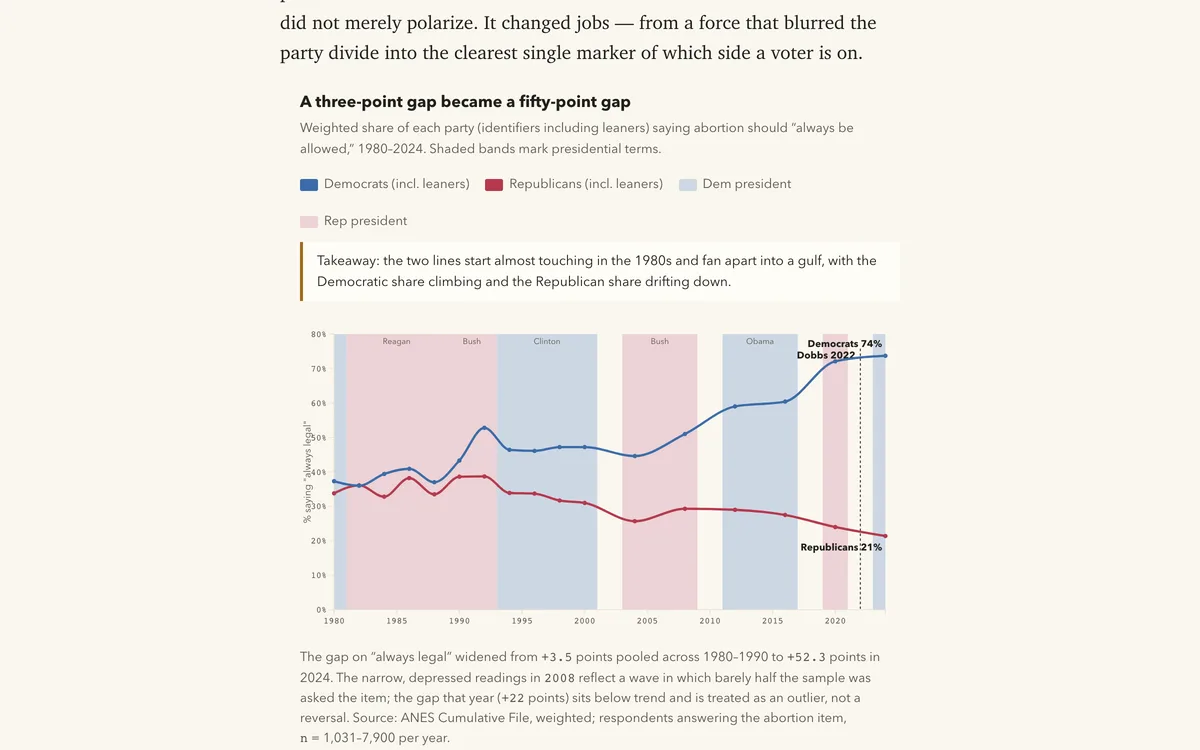
America Didn’t Wait for the Unsorted to Die — They Switched

Track ANES cross-pressured voters from 1972-2024 to test whether partisan sorting came from generational replacement or switching among existing cohorts.

DecompositionSurvey analysisSurvey data
Blog
Polarization & Public Opinion

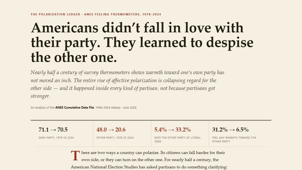
Americans Didn’t Fall in Love With Their Party. They Learned to Despise the Other One.

Use ANES feeling thermometers from 1978-2024 to separate in-party warmth from out-party dislike, distributional zeros, and affective polarization.

DecompositionSurvey dataDistribution
Blog
Polarization & Public Opinion

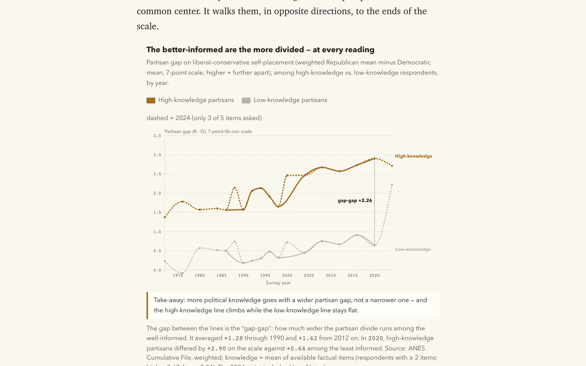
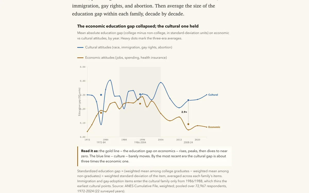
Information Doesn't Cool the Argument. It Sharpens It.

Across the ANES 1972-2024, the partisan gap on policy and racial attitudes is widest among the most politically knowledgeable Americans -- every year, and by a growing margin, even net of education. Information sorts; it does not depolar…

Survey dataInequality analysisDistribution
Blog
Polarization & Public Opinion

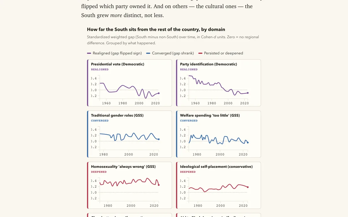
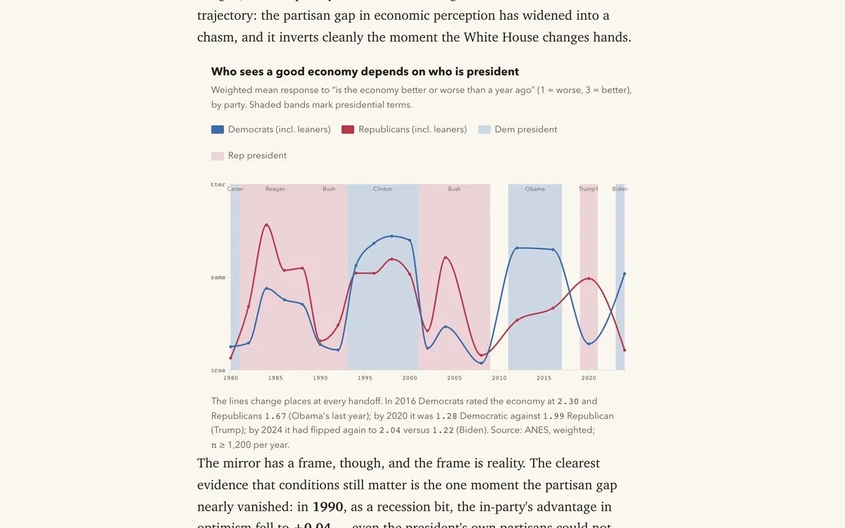
One Country, Two Timelines

ANES, GSS, and county returns show the American South did three things at once: it realigned on party and the vote, converged on economics, and grew more distinct on religion and culture.

Inequality analysisTrend analysisSurvey data
Blog
Polarization & Public Opinion

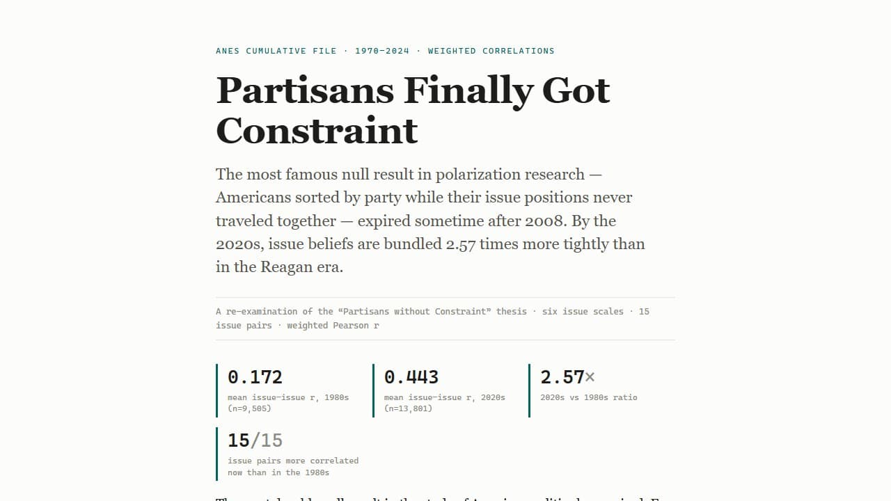
Partisans Finally Got Constraint

Revisit the partisans-without-constraint thesis with ANES issue-scale correlations, party-identification alignment, heatmaps, and sorting decompositions from 1970-2024.

CorrelationHeatmapDecomposition
See all 17 in Polarization & Public Opinion

The press, the archive, and the ad ledger — how stories get told, what gets covered, and who pays to be seen.

BlogNew
Media, News & Advertising

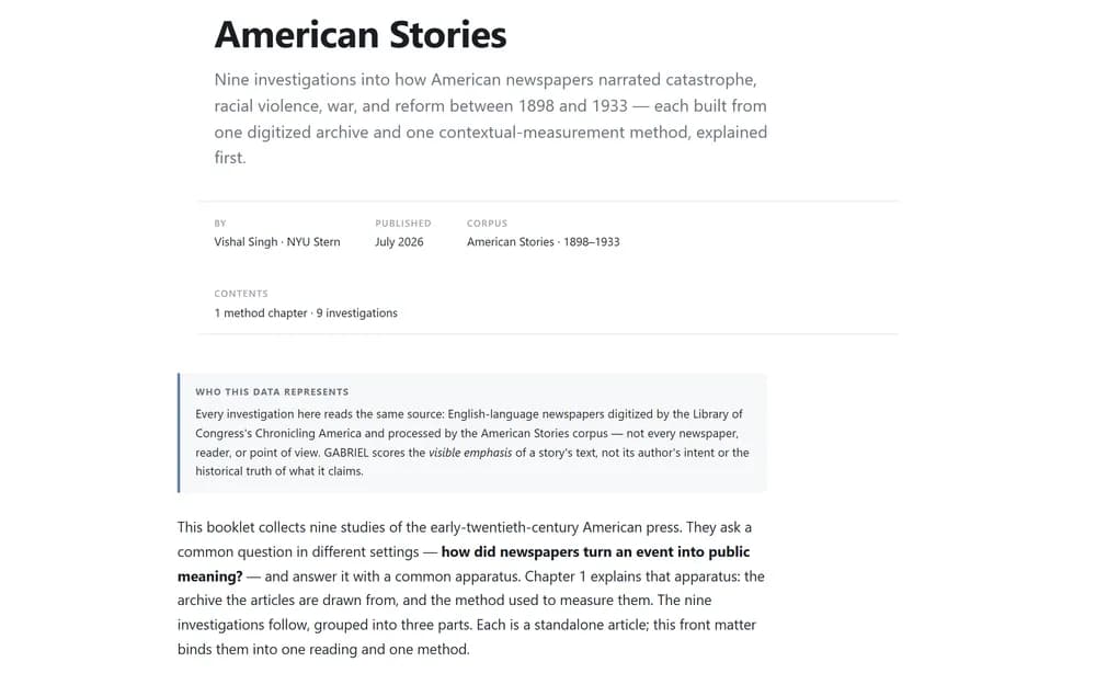
American Stories — A Booklet

A bound reading of nine American Stories investigations: how U.S. newspapers narrated catastrophe, violence, and reform between 1898 and 1933. Opens with the data and the GABRIEL method behind every article.

Text analysisIndex constructionTrend analysis
Teaching
Media, News & Advertising

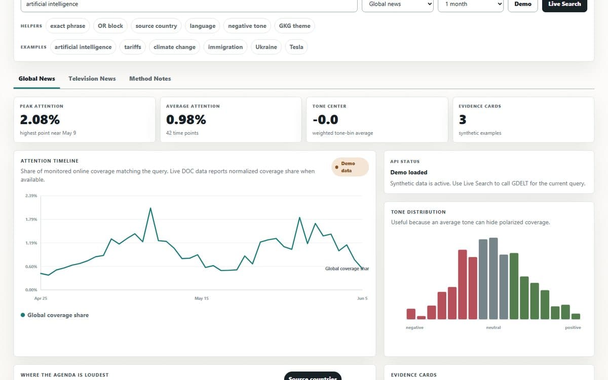
GDELT Media Agenda Lab

Search global news and television coverage as an agenda-setting lab: compare attention, tone, source geography, station airtime, and evidence cards from live GDELT APIs.

DashboardText analysisLive API
6 parts · ongoing

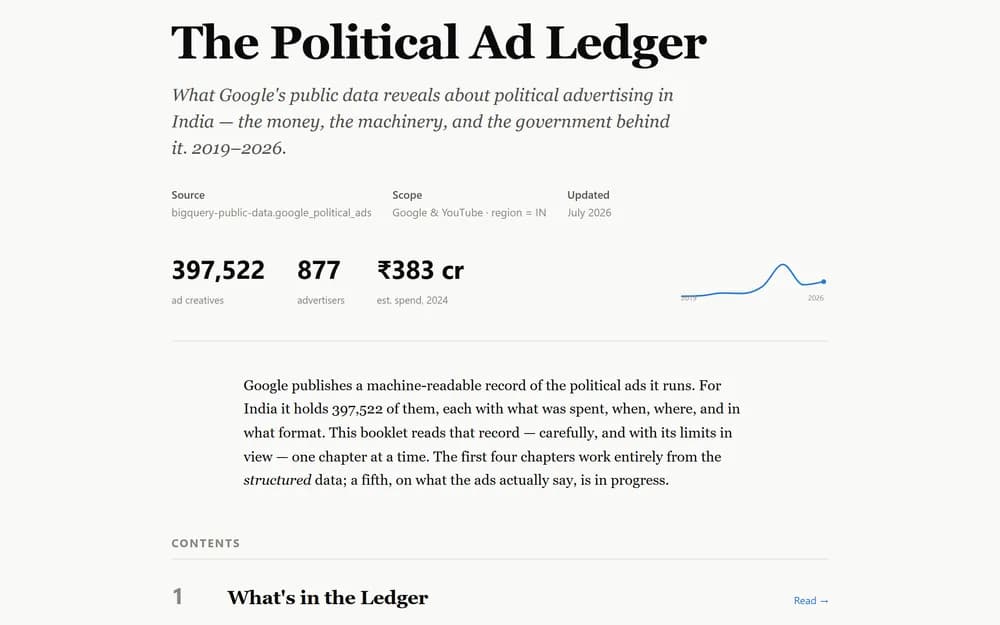
The Political Ad Ledger

A five-part read through India's political advertising disclosures — who buys, what they say, and what the ledger leaves out.

Open the collection
BlogNew
Media, News & Advertising

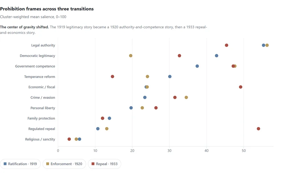
How a Moral Crusade Became a Governance Problem

Prohibition entered the Constitution through moral reform and democratic legitimacy. Fourteen years later, newspapers buried it under economics, administration, and regulated repeal.

hugging facenlp
TeachingNew
Media, News & Advertising

The Dead They Didn't Count

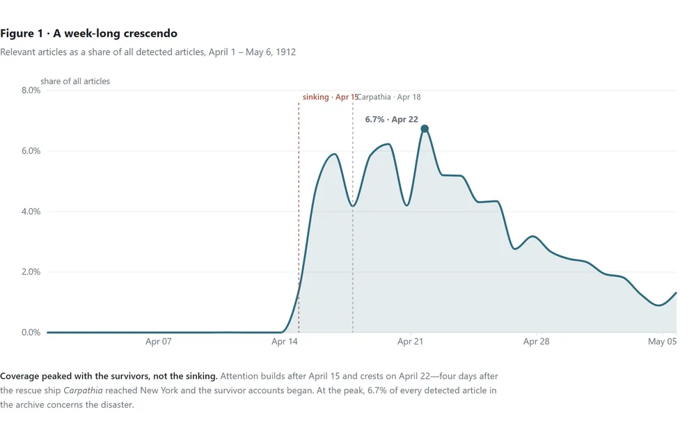
18,863 newspaper articles show how the American press framed the Titanic: quick to blame the company and mourn the spectacle, but nearly silent on the immigrant poor in steerage who died in the greatest numbers.

hugging facenlp
Blog
Media, News & Advertising

Nine Thousand Bylines

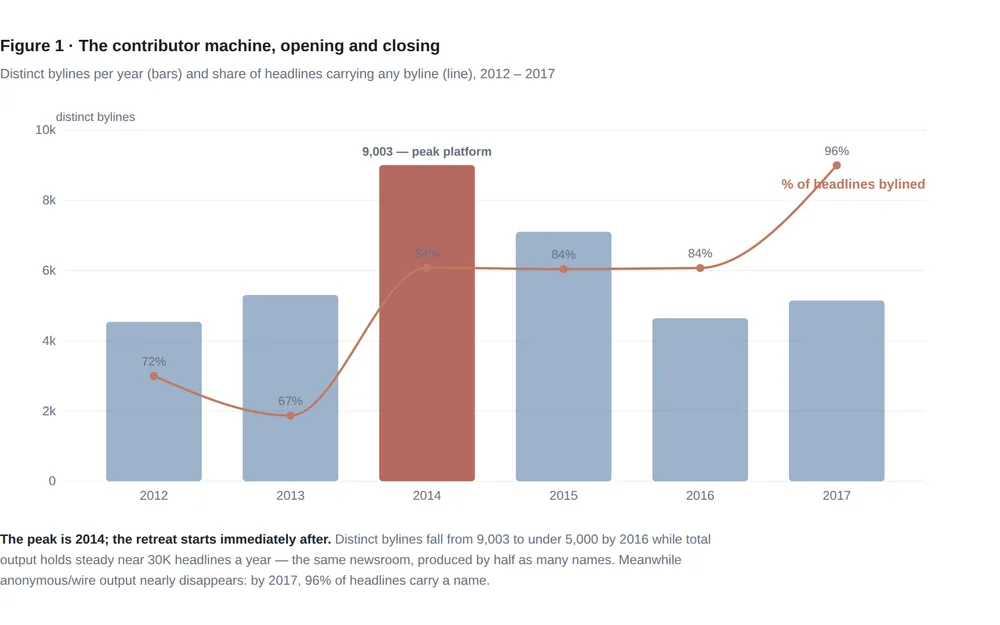
HuffPost's author fields record a business model reversing in real time: a 9,000-contributor open platform in 2014 re-concentrates into a staff core writing 42% of bylined output by 2016.

Text analysisTime seriesRanking
See all 11 in Media, News & Advertising

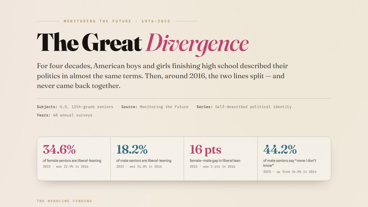
Adolescence in the data: mental health, school, sleep, substances, politics, and belief among American teens across five decades.

Life expectancy, overdose deaths, chronic disease, and the geography of health across states, counties, and ZIP codes.
App
Health & Mortality

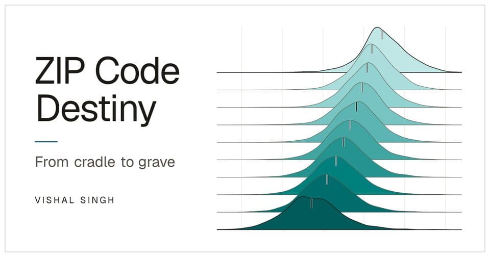
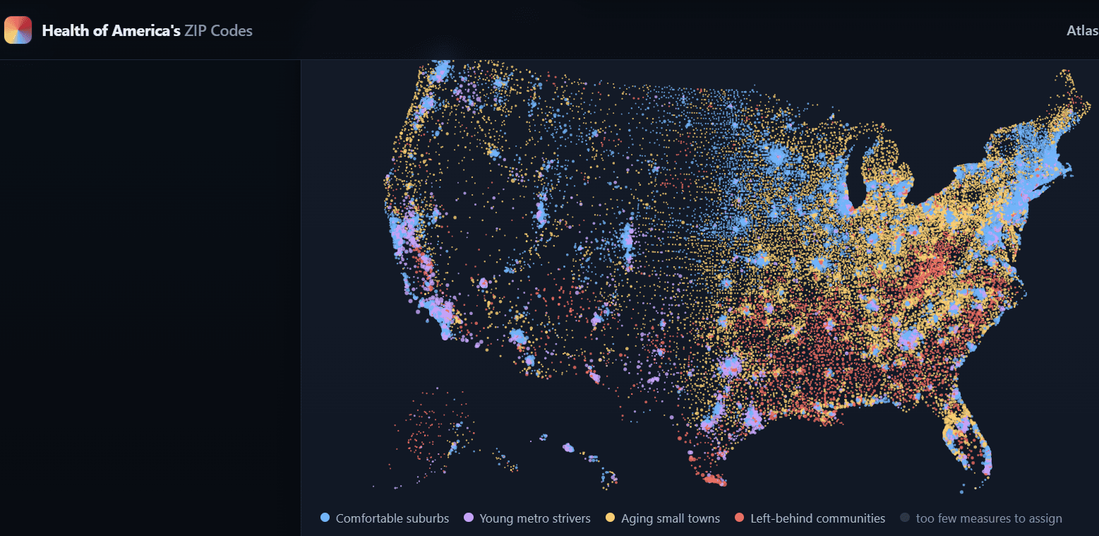
Health of America’s ZIP Codes

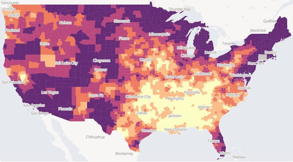
A map-first atlas of 26 health and social-need measures across 32,409 ZIP/ZCTAs (CDC PLACES + Census), with stories and methodology.

public-healthzipplaces
Blog
Health & Mortality

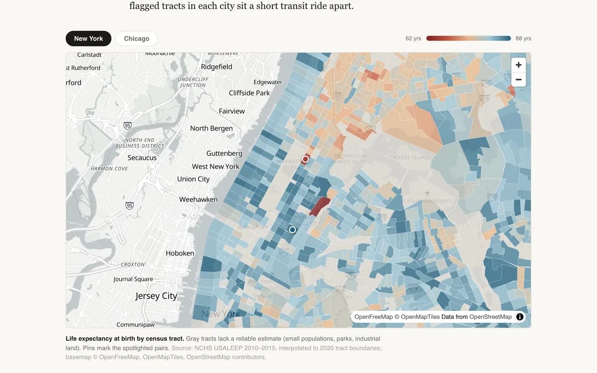
Four Subway Stops, Twenty-Four Years

Within a single American county, life expectancy at birth can differ by more than two decades. A tract-level tour of New York and Chicago.

ChoroplethHealth / mortality dataGeospatial analysis
Teaching
Health & Mortality

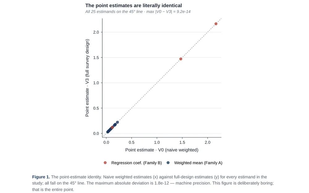
Same Betas, Three Standard Errors · NHANES

One NHANES dataset, four variance machines, and exactly what the naive standard error quietly gets wrong.

RegressionSurvey analysisSurvey data
Blog
Health & Mortality

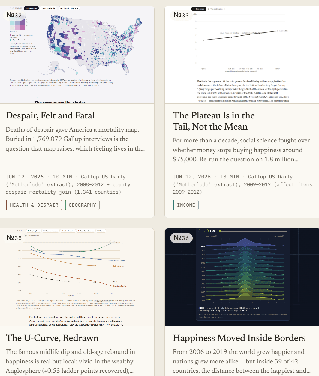
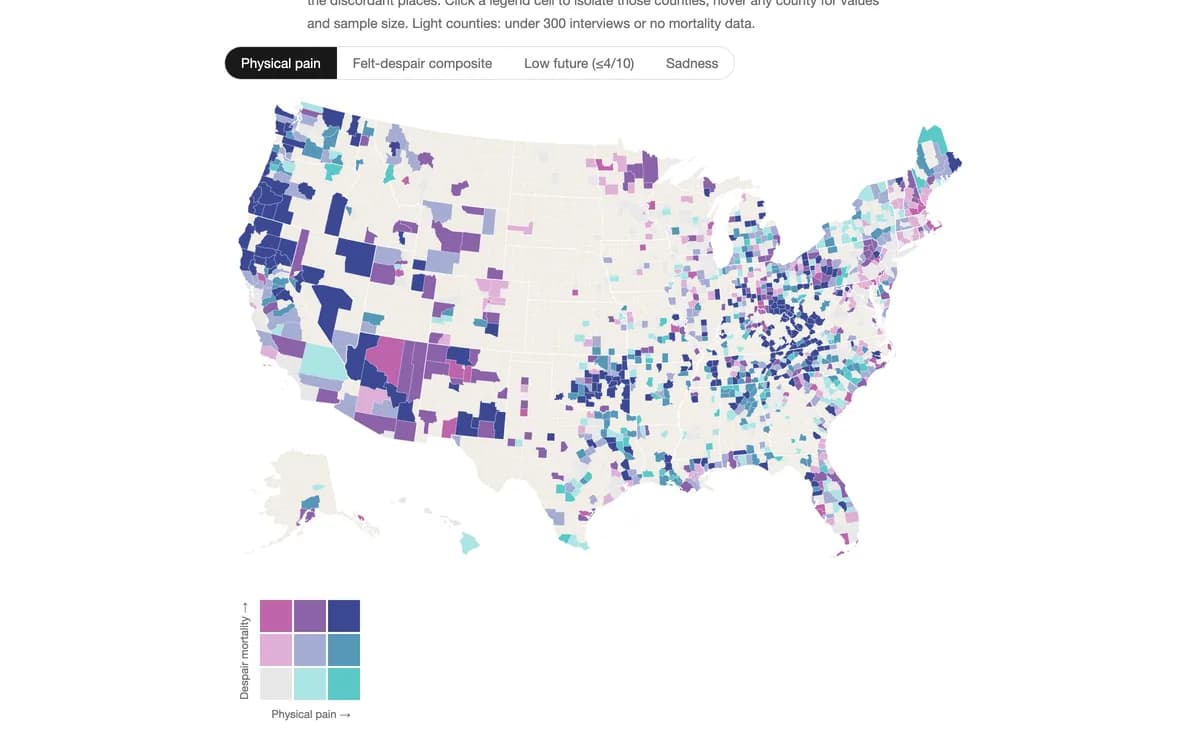
Deaths of Despair vs. Felt Despair

Case and Deaton mapped where Americans die of suicide, drugs, and alcohol. Gallup spent a decade asking Americans how yesterday felt. Lay the feelings over the deaths, and the measure that tracks the mortality map best is not sadness, no…

ChoroplethCorrelationHealth / mortality data
Blog
Health & Mortality

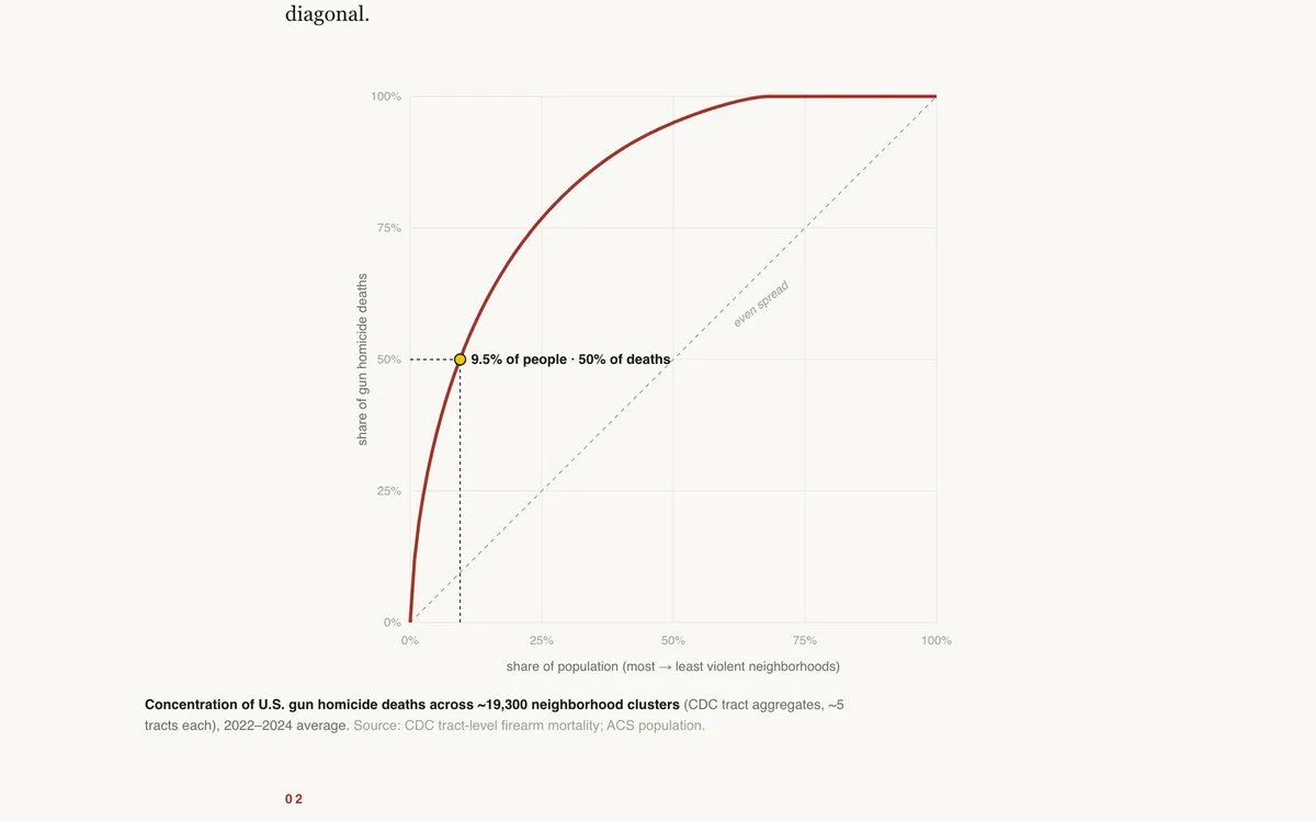
Half the Deaths, a Sliver of the Map

Half of America's gun homicides happen in neighborhoods housing about 9.5 percent of its people. Lorenz curves and a block-level look at Chicago.

Inequality analysisGeospatial analysisChoropleth
Teaching
Health & Mortality

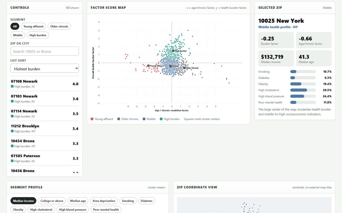
NYC Metro ZIP Health Segments

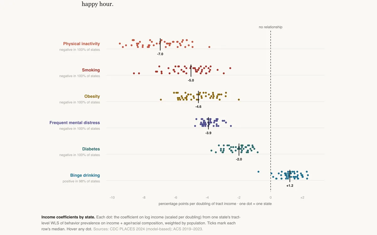
Use health prevalence measures to build factor scores, cluster ZIP codes, and interpret the segments by correlating scores with income, age, college share, and deprivation.

PCA / clusteringDashboardSegmentation
See all 17 in Health & Mortality

Life satisfaction, time use, stress, and social connection — what large surveys reveal about how Americans are actually doing.

Blog
Happiness & Well-Being

2020: The World's Worst Year?

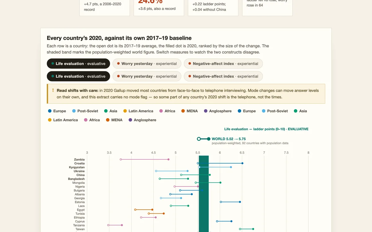
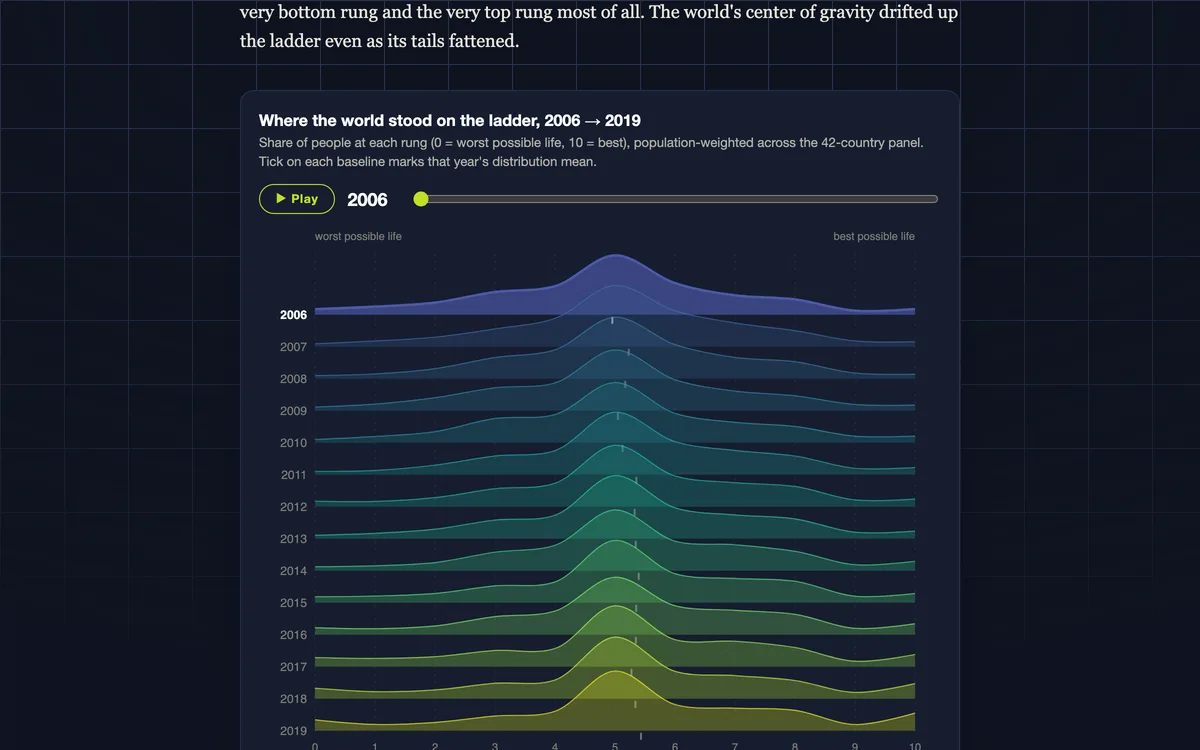
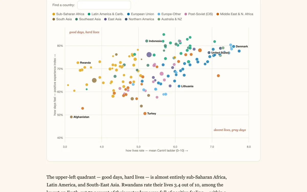
Gallup World Poll, 93 countries: in 2020 daily worry, sadness and stress hit their highest recorded levels, while the world’s rating of its own life barely moved.

Shock analysisSurvey analysisScatter plot
Blog
Happiness & Well-Being

The Well-Being Atlas

A publication of reproducible data essays on life satisfaction — Gallup World Poll, GSS, and WVS microdata across 50 years and 168 countries.

Survey analysisChoroplethSurvey data
Blog
Happiness & Well-Being

Alone Together

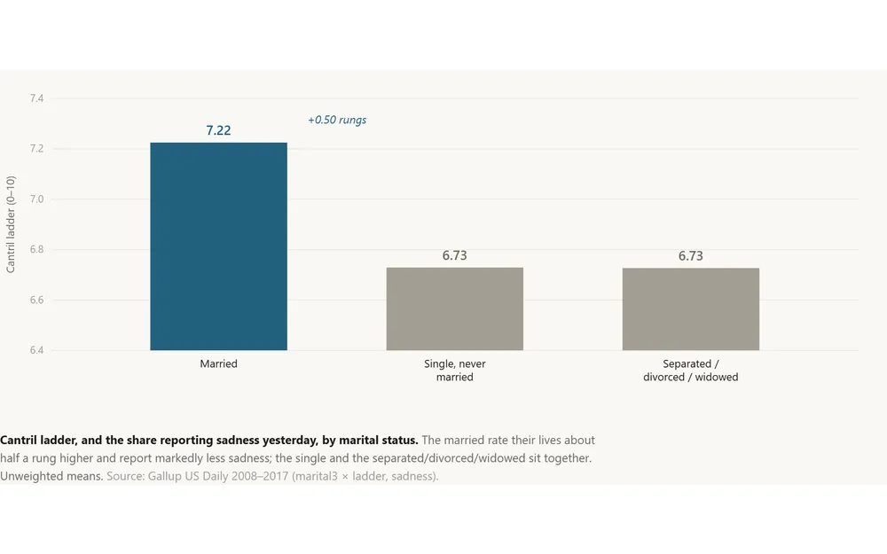
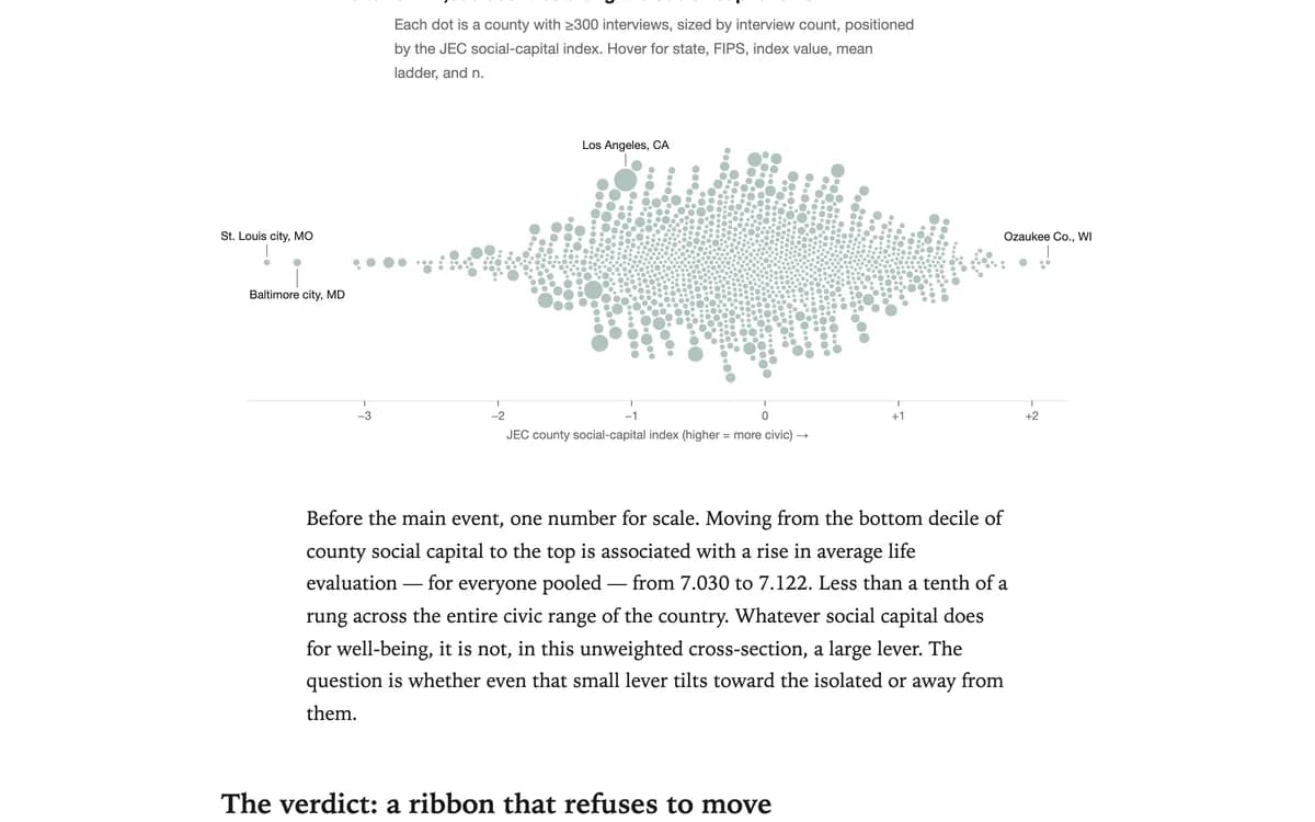
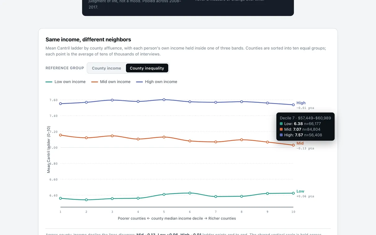
A partner is worth about half a rung of the Cantril ladder, and the premium survives wherever you live. But a civic-rich county does not rescue the isolated — the married-vs-unmarried gap is the same in high-social-capital places and low…

RegressionInequality analysisBenchmarking
Blog
Happiness & Well-Being

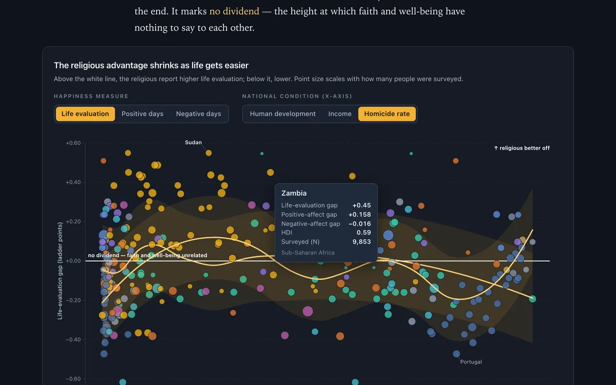
Does Generosity Pay - Everywhere?

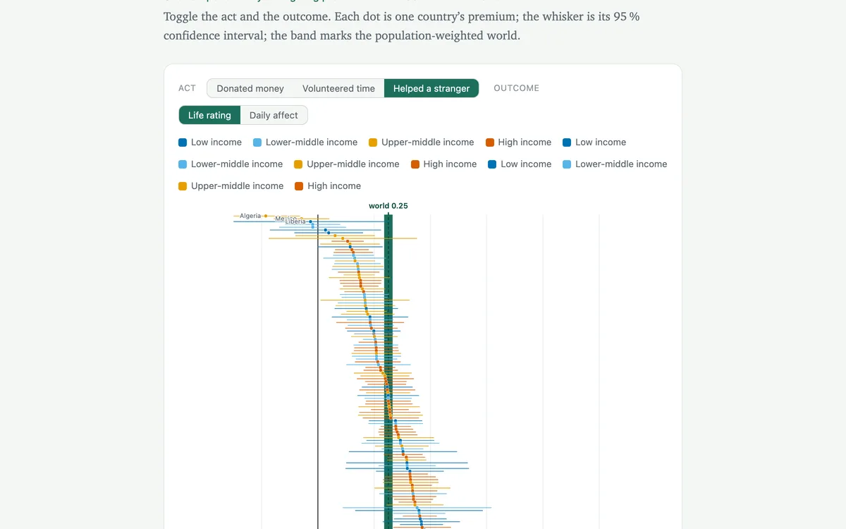
Across 155 countries, people who give — money, time, or a hand to a stranger — rate their lives higher and feel better day to day. The link is remarkably stubborn: it holds in rich countries and poor ones alike, and it is strongest for g…

RegressionSurvey analysisSurvey data
Blog
Happiness & Well-Being

Does the Ring Still Matter?

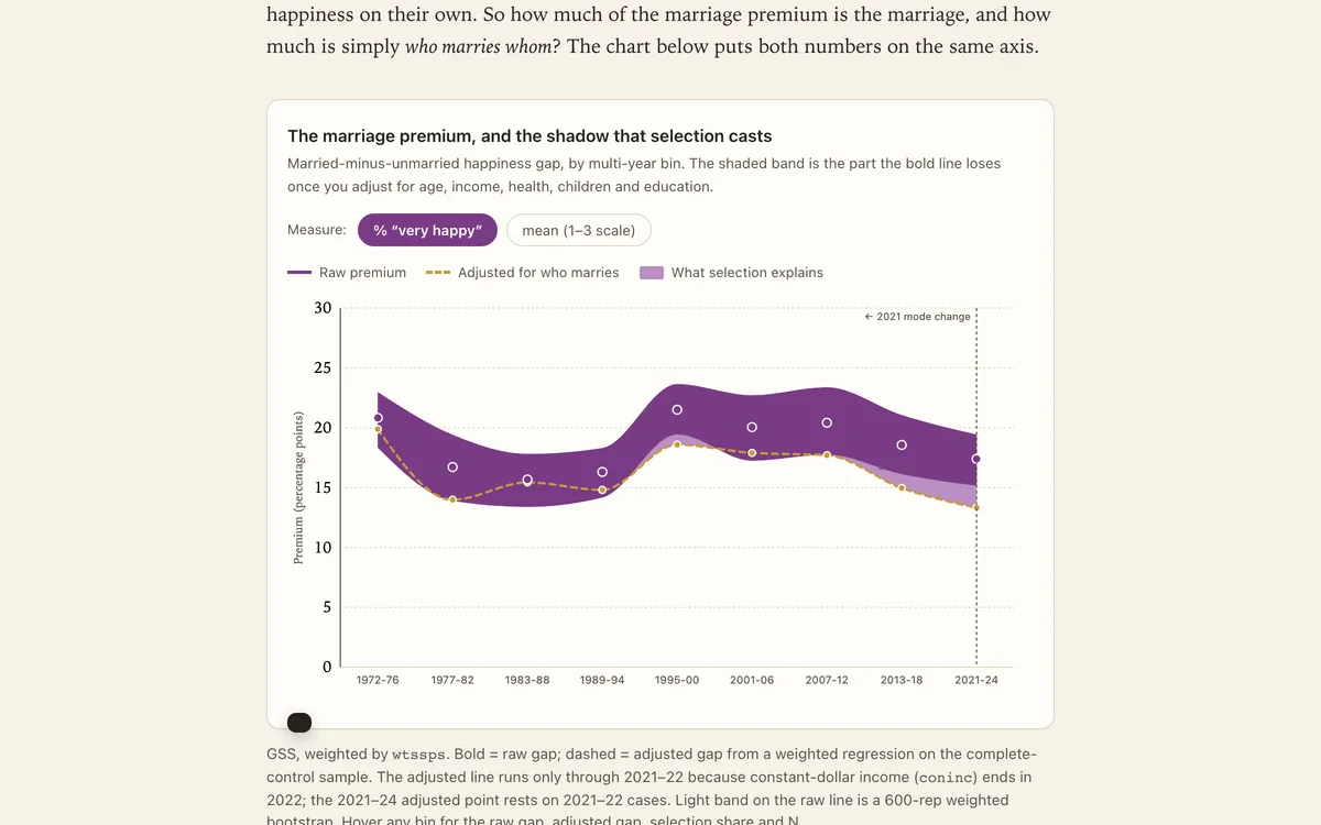
For fifty years, married Americans have reported being happier than everyone else. The gap has barely budged — and most of it survives even after you account for who tends to marry.

Survey dataDecompositionRegression
Blog
Happiness & Well-Being

Does Community Substitute for Connection?

Putnam's heirs promised that civic fabric lifts everyone. Three and a half million Gallup interviews ask the sharper question: does it lift the people who need it most?

Inequality analysisIndex constructionRegression
See all 21 in Happiness & Well-Being

Pricing, competition, advertising, and market structure — data stories and teaching cases from the business world.

See all 26 in Business & Markets

Spending, saving, debt, and financial fragility — how American households earn, borrow, and manage money.

Blog
Consumer & Household Finance

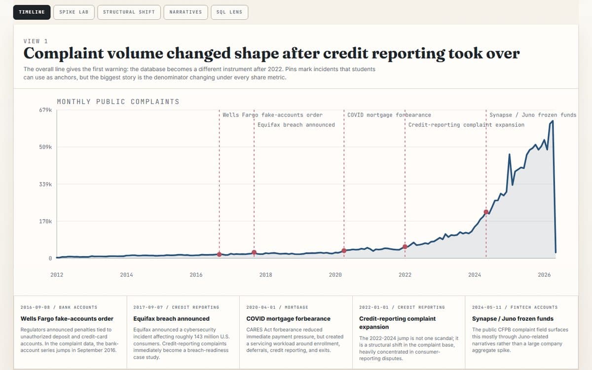
The Complaint Machine

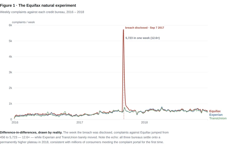
16.7 million CFPB complaints: the cleanest natural experiment in consumer finance, and a database that one product category swallowed whole.

Text analysisCausal inferenceTrend analysis
Blog
Consumer & Household Finance

The Fed Hiked. Your Credit Card Noticed.

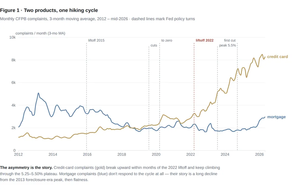
Fourteen years of CFPB complaints show monetary policy reaching households through exactly one door: credit-card complaints triple after the 2022 hikes while mortgage complaints never move.

Shock analysisTime seriesCausal inference
Blog
Consumer & Household Finance

The January Echo

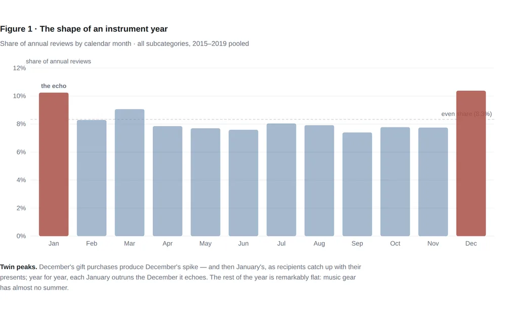
Amazon's musical-instrument reviews peak in January, not December — the sound of a million gifts being unboxed. Seasonality cleanly separates the instruments people give from the gear working musicians buy.

Text analysisTrend analysisScanner / CPG
Blog
Consumer & Household Finance

Feeling Rich Is Not the Same as Being Rich

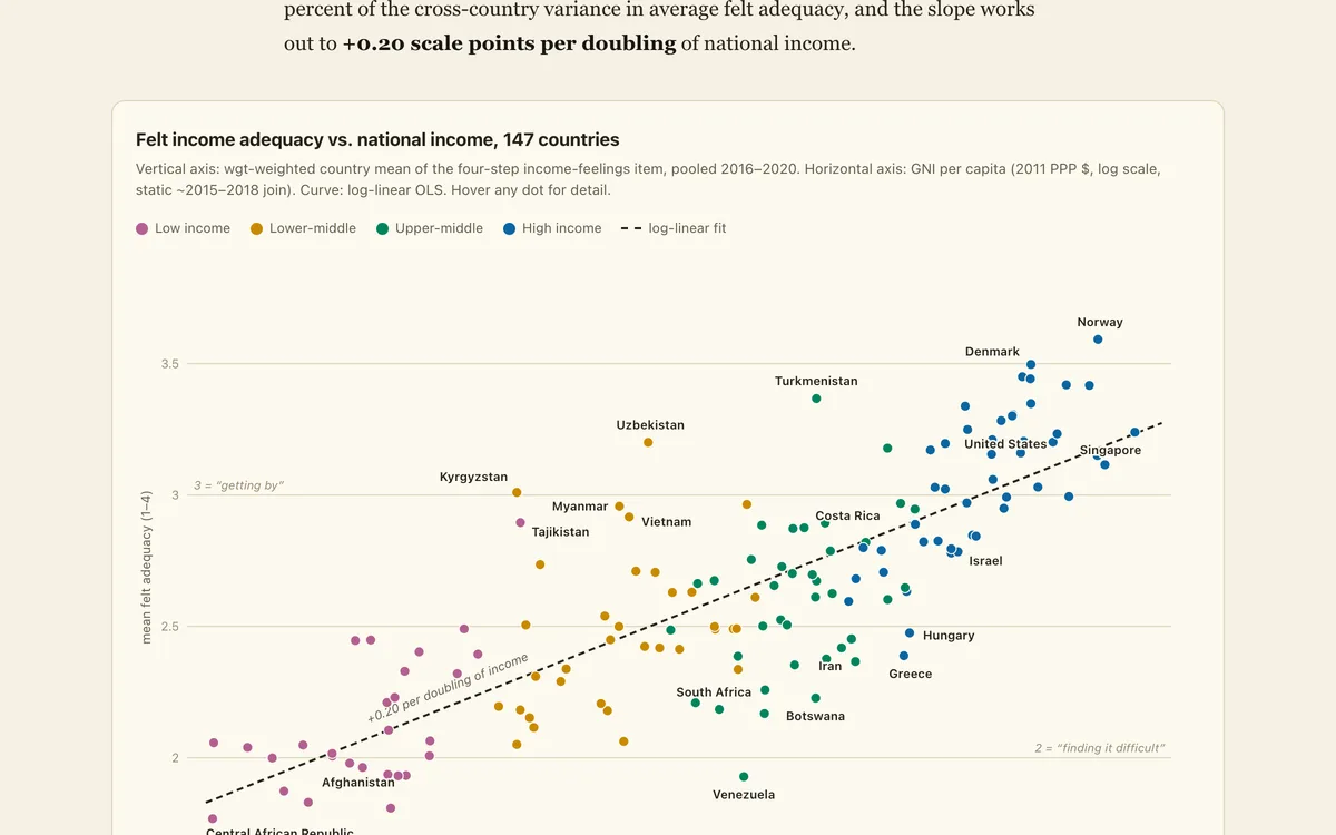
Across 147 countries, money reliably buys the feeling of financial sufficiency — and the feeling never tops out, across countries or within them. But whole regions feel far richer, or poorer, than their income says they should.

Inequality analysisRegressionSurvey data
Blog
Consumer & Household Finance

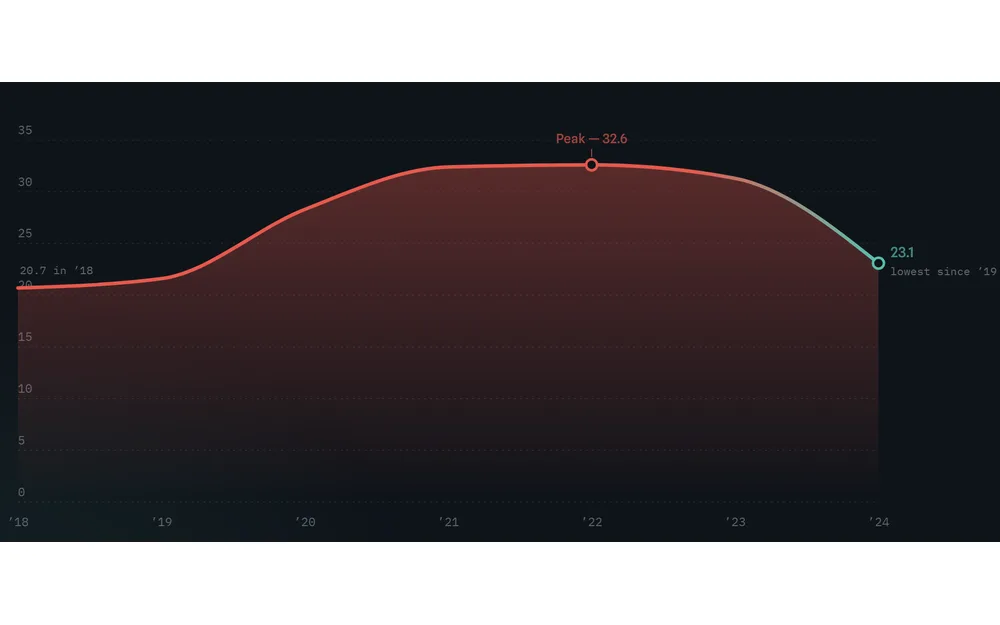
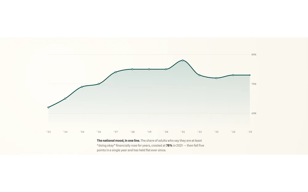
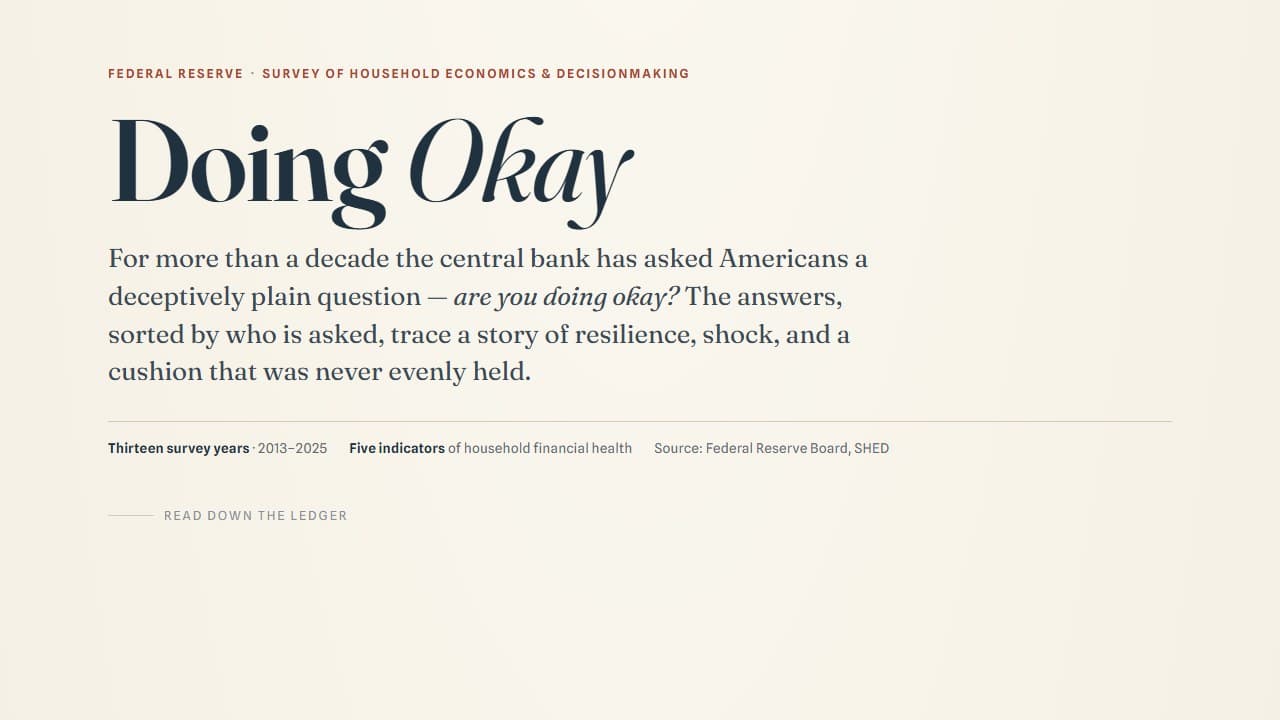
The Peak and the Plateau — A Decade of American Financial Well-Being

For a decade, Americans felt steadily better about their money. Then 2022 took it back — and the recovery never came.

Survey analysisTrend analysisInequality analysis
Dataset
Consumer & Household Finance

Zillow state ZHVI panel

Wide state-level Zillow Home Value Index panel with monthly columns from 2000 through 2026.

housingtime seriesstate panel
See all 9 in Consumer & Household Finance

Income and wealth gaps, economic mobility, and who gets ahead — evidence across places, cohorts, and generations.

Blog
Inequality & Mobility

The Places That Beat the Model

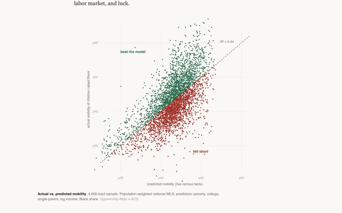
A five-variable model predicts neighborhood mobility with R² = 0.44. The residuals are the interesting part: the counties that out-perform their demographics, and the boomtowns that don't.

BenchmarkingRegressionScatter plot
Teaching
Inequality & Mobility

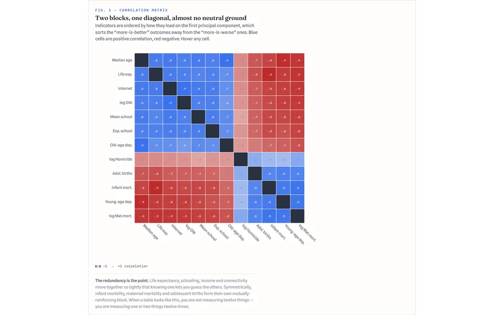
An Index Autopsy

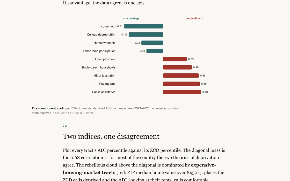
We rebuilt a deprivation index from scratch with PCA — no housing costs — and compared it to the canonical ADI. They agree on the gradient and disagree violently about New York.

Index constructionDimensionality reductionBenchmarking
Blog
Inequality & Mobility

Raised Poor, Locked Up

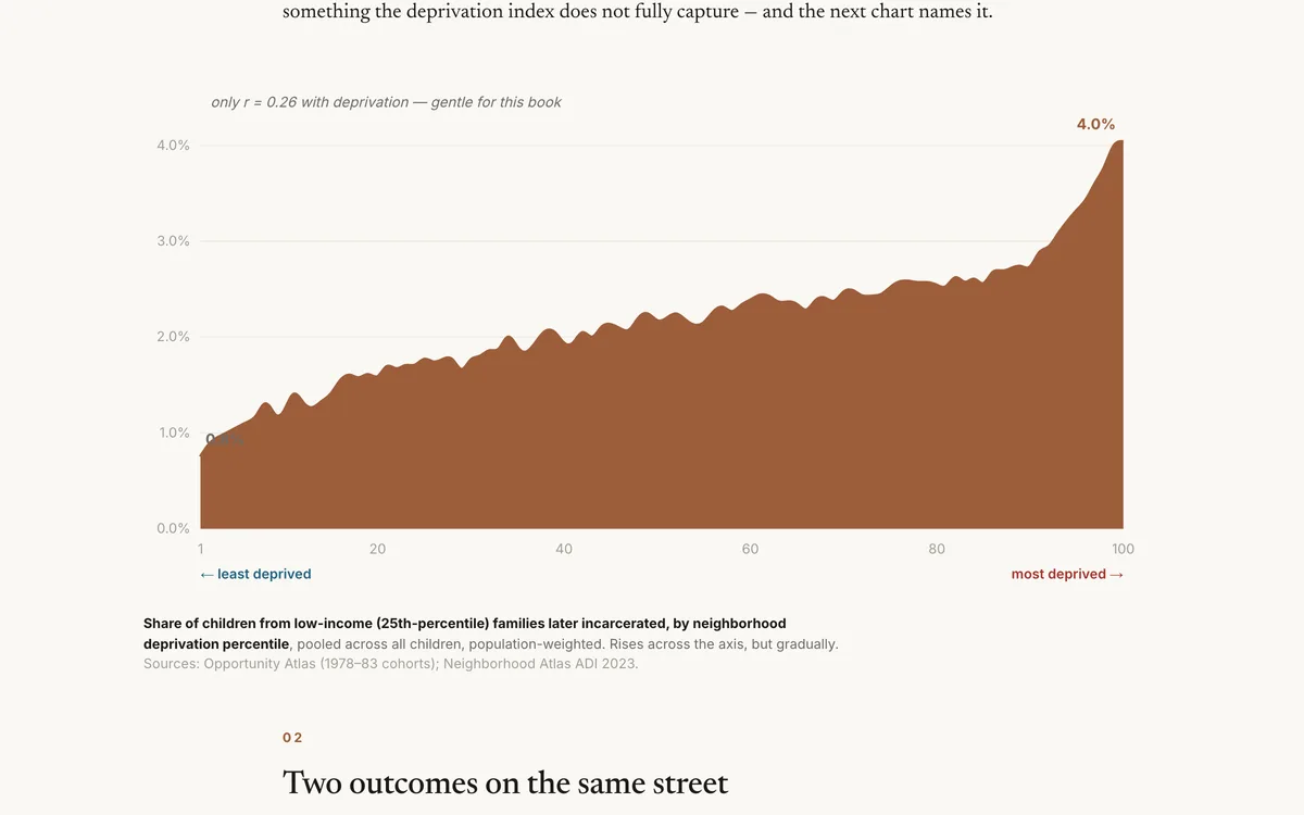
For boys raised by poor families, the odds of growing up incarcerated rise with neighborhood deprivation — and, on the very same streets, fall heavily by race.

Inequality analysisCorrelationScatter plot
Blog
Inequality & Mobility

The Born-Rich Premium

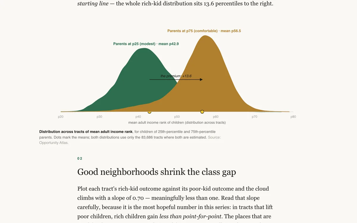
What does a rich birth buy? The Opportunity Atlas prices the class premium neighborhood by neighborhood — and it varies twofold across America.

RegressionChoroplethInequality analysis
Blog
Inequality & Mobility

The Company You Keep

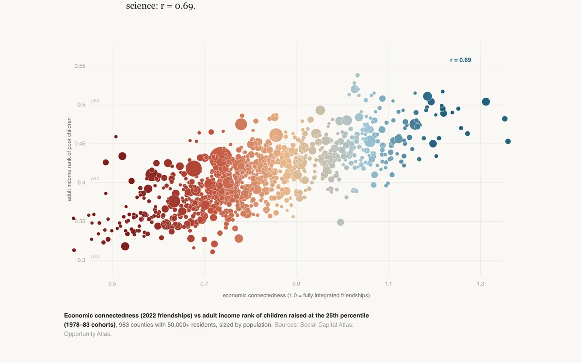
Twenty-one billion Facebook friendships, one question: which kind of social capital actually predicts whether poor children rise? Cross-class friendship does. Volunteering, clubs, and tight-knit networks barely register.

DecompositionScatter plotChoropleth
Teaching
Inequality & Mobility

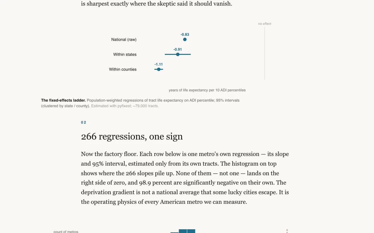
The Slope Factory

We fit the deprivation–life-expectancy regression separately in 266 American metros. Every single slope came back negative. Many small models, one law.

RegressionSmall multiplesDistribution
See all 7 in Inequality & Mobility

Population change, migration, family structure, and the social fabric — the long-run shifts beneath the headlines.

App
Demographics & Society

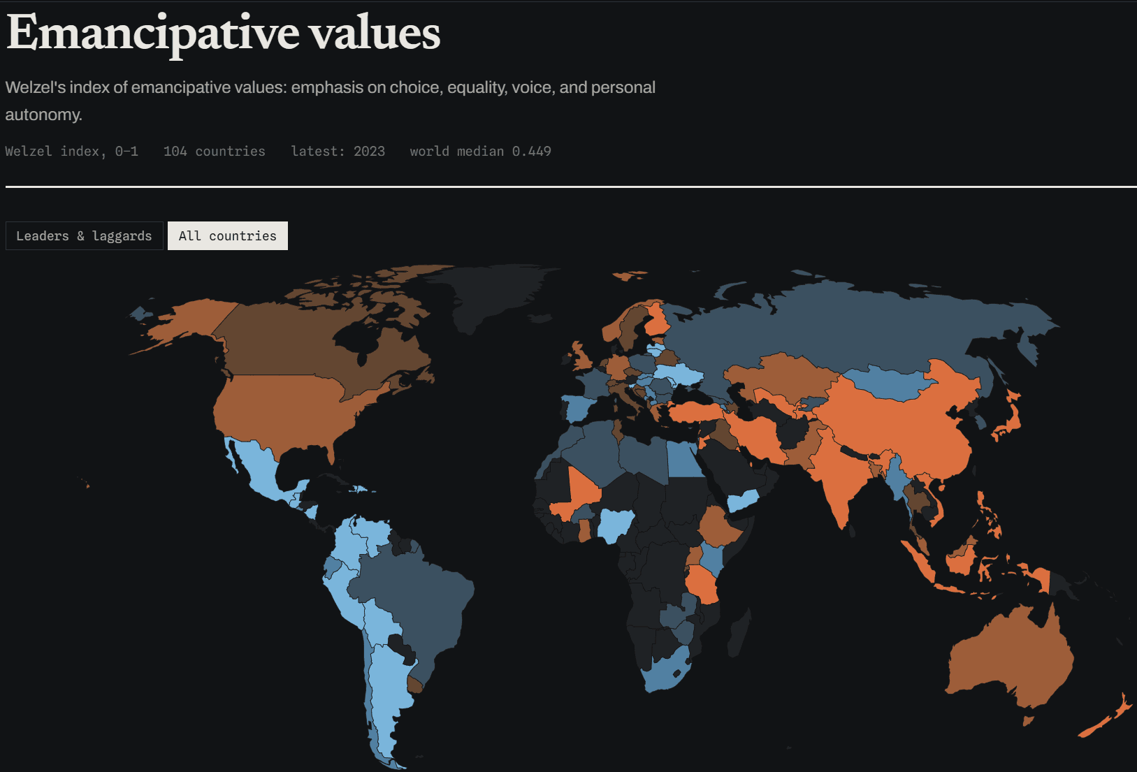
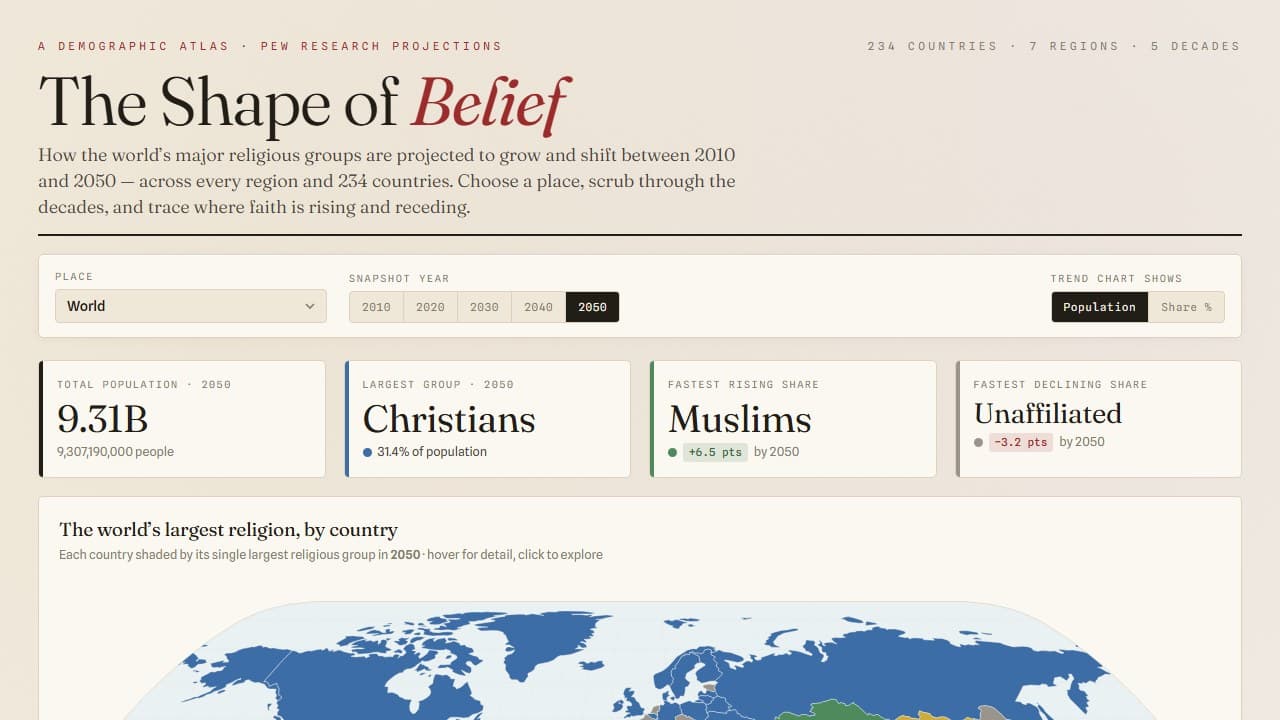
Worldlines — The World in Numbers

A cross-country indicators explorer — 85 measures of development, democracy, belief, and wellbeing across 217 countries (1750–2025), with country profiles, rankings, and peer benchmarking.

indicatorscross-countryworld-bank
Blog
Demographics & Society

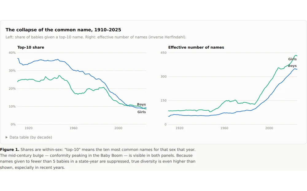
America Ran Out of Common Names

A century of Social Security records shows the quiet collapse of the common first name — and that name fads now burn out twice as fast as they used to.

Trend analysisTime seriesCensus / ACS
Blog
Demographics & Society

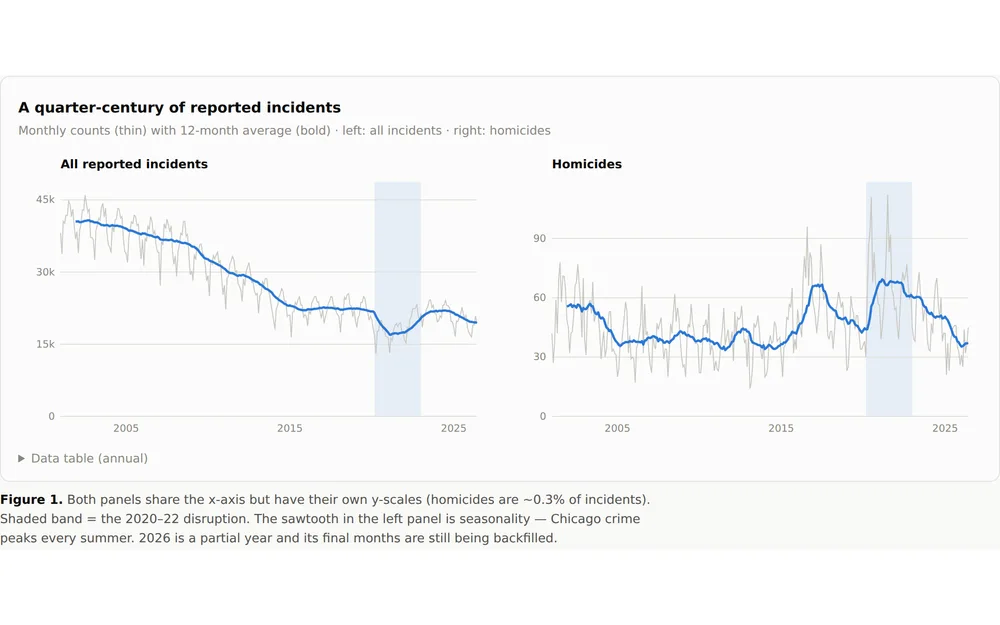
The Rhythm of a City

8.6 million reported incidents over 25 years give Chicago crime a legible pulse: hourly, weekly, seasonal — and three distinct eras.

Trend analysisGeospatial analysisTime series
Blog
Demographics & Society

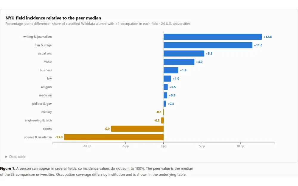
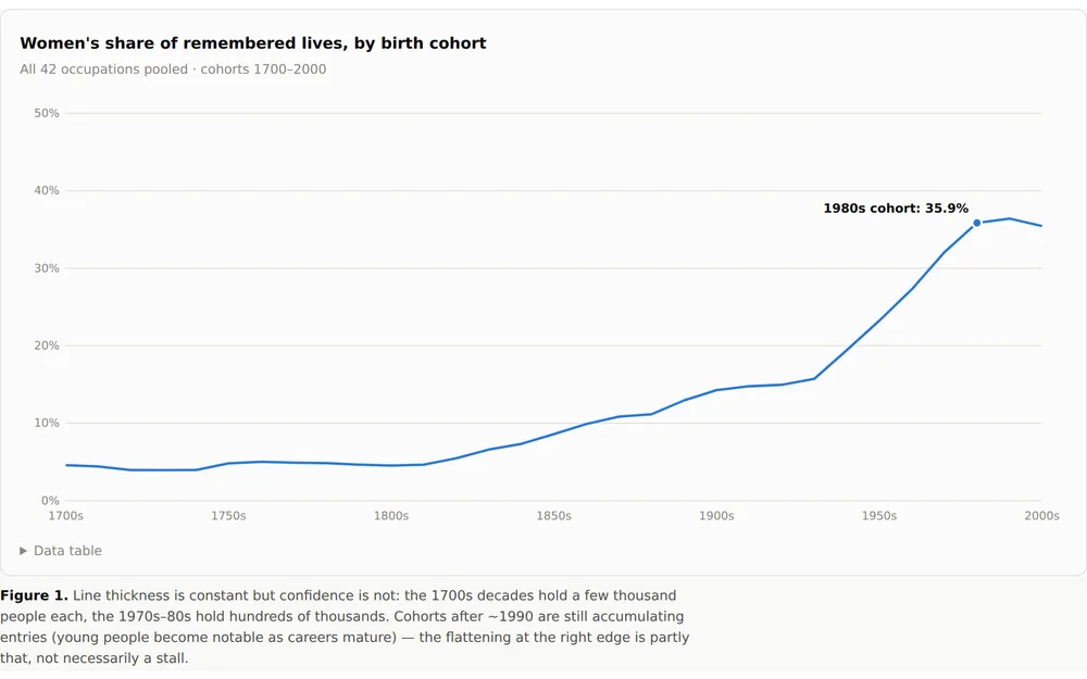
Who Gets Remembered

4.4 million Wikidata biographies, sliced by birth cohort, occupation and gender: a measurement of memory itself.

Trend analysisInequality analysisSmall multiples
Blog
Demographics & Society

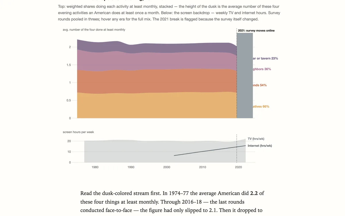
Fifty Years of American Evenings

Since 1974 the GSS has asked the same four questions: how often do you spend an evening with relatives, with friends, with neighbors — or at a bar? The answers trace a half-century in which company grew rarer, screens grew brighter, and…

Survey analysisTrend analysisTime series
Teaching
Demographics & Society

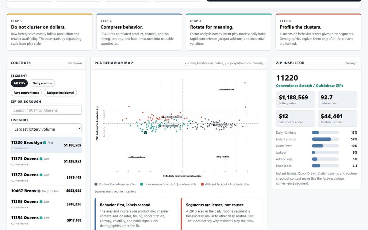
Lottery ZIP Psychographics: How Neighborhoods Play

Segment active NYC ZIP codes from NY Lottery behavior signals, then interpret the PCA/factor score space with borough, income, retailer availability, and product-mix profiles.

PCA / clusteringDashboardSegmentation
See all 11 in Demographics & Society

Colleges, school districts, and the people they produce — cost and earnings, alumni networks, grade inflation, and who gets through.

Religious affiliation, practice, and belief — the reshaping of American religious life, told through survey data.

What language models can and cannot measure — benchmarks, meaning, bias, and using LLMs as instruments on real data.
Blog
AI & Language Models

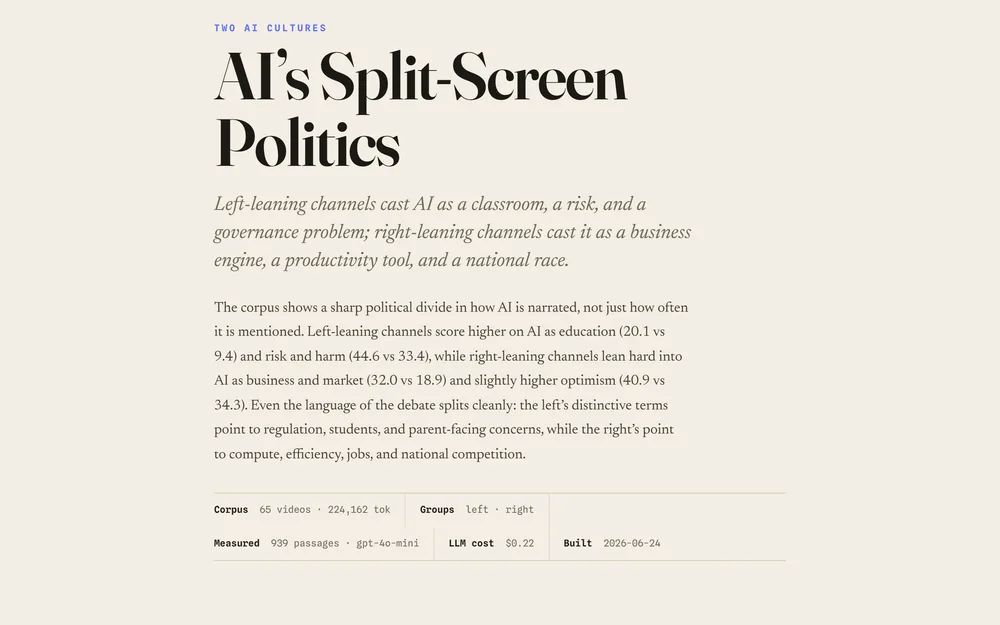
AI’s Split-Screen Politics

Left-leaning channels cast AI as a classroom, a risk, and a governance problem; right-leaning channels cast it as a business engine, a productivity tool, and a national race.

Text analysisClassificationSegmentation
App
AI & Language Models

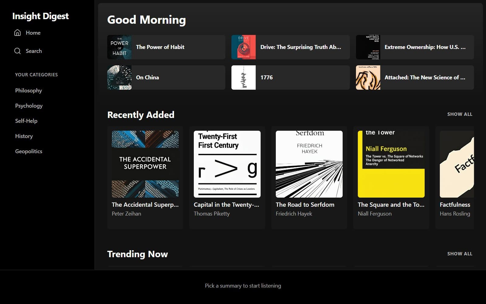
Insight Digest

AI-generated book summaries to read or listen to — across philosophy, psychology, self-help, history, and geopolitics.

aibook summariesaudio
TeachingNew
AI & Language Models

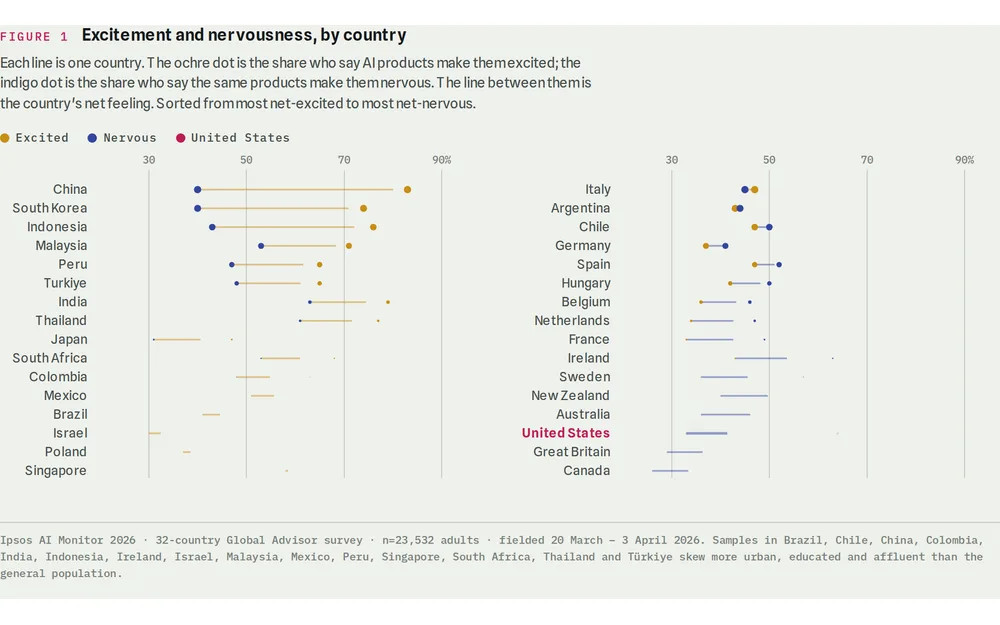
The Gap Is the Story — Public Opinion on AI, Re-Checked

Nine charts on global and US public opinion about artificial intelligence, verified against source data, plus a ledger of what a widely circulated research summary got wrong.

ai opinionsurvey
TeachingNew
AI & Language Models

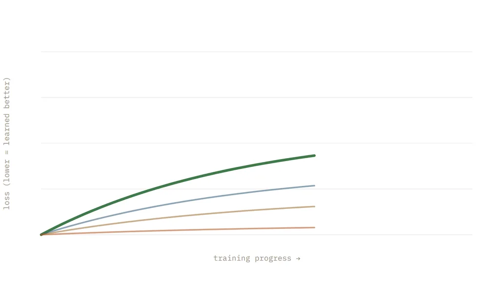
Beyond the Stochastic Parrot — Chomsky, LLMs, and the Nature of Meaning

An interactive essay on the stochastic-parrot debate: what Chomsky claims, how language models actually work, and what the evidence says about machine understanding.

Text analysisClassificationBenchmarking
BlogNew
AI & Language Models

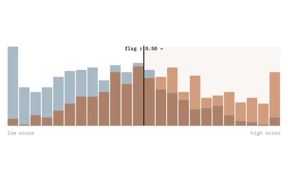
The Fairness You Can't Have — COMPAS, ProPublica, and the impossibility theorem

An interactive essay on algorithmic fairness: the COMPAS recidivism controversy, why calibration and equal error rates cannot both hold when base rates differ, and what the impossibility theorem means for anyone deploying a model.

Causal inferenceClassificationBenchmarking
Blog
AI & Language Models

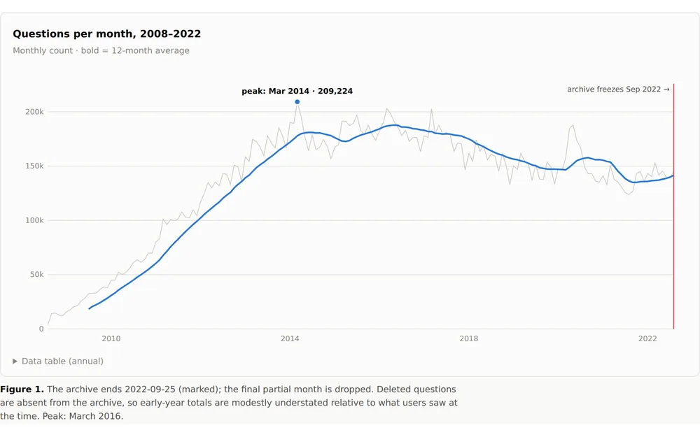
The Commons Was Already Dying

23 million Stack Overflow questions show the knowledge commons peaked in 2016 and hardened long before ChatGPT arrived to finish the job.

Trend analysisTime seriesDecomposition
See all 10 in AI & Language Models

Methods, AI & Data

3 pieces